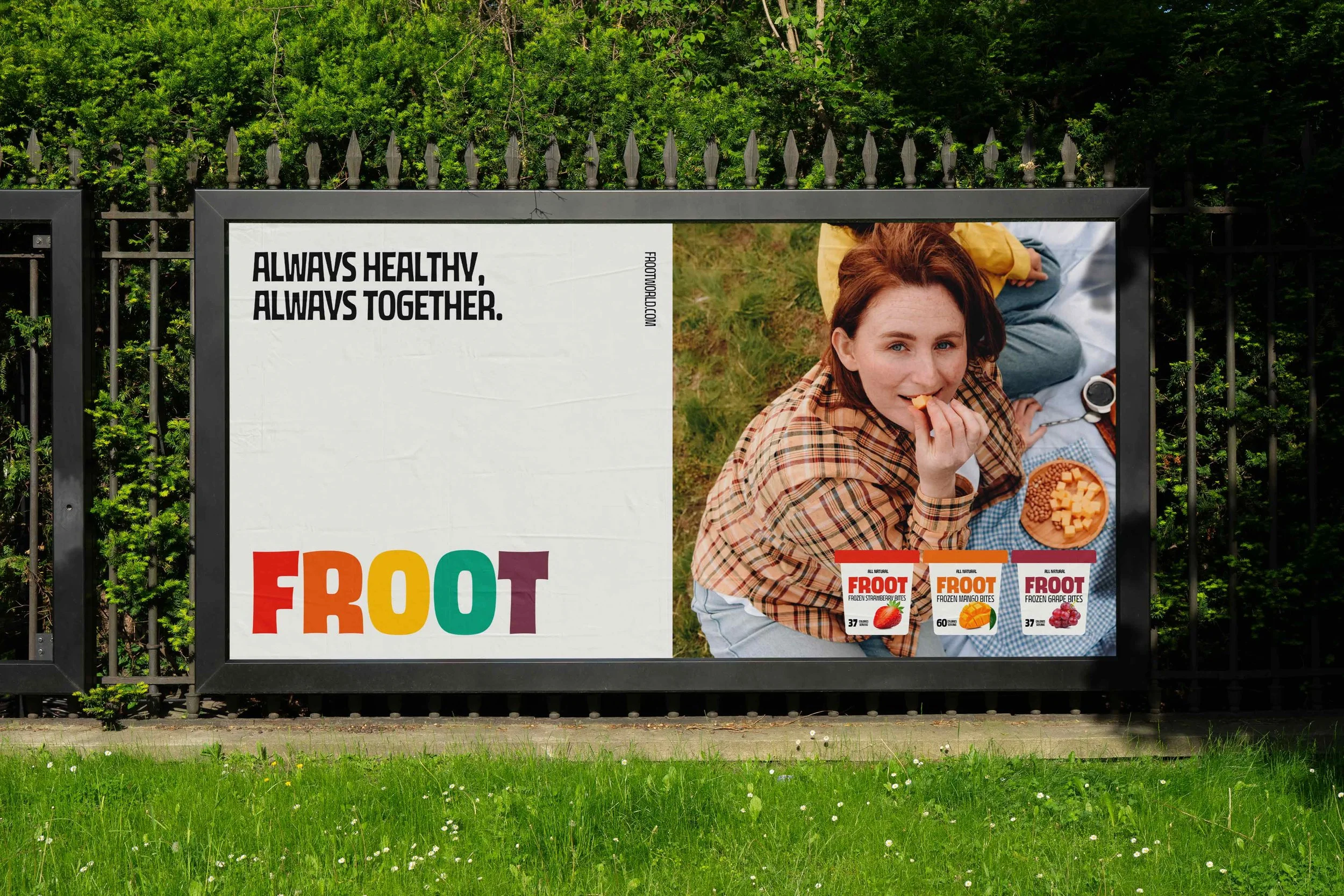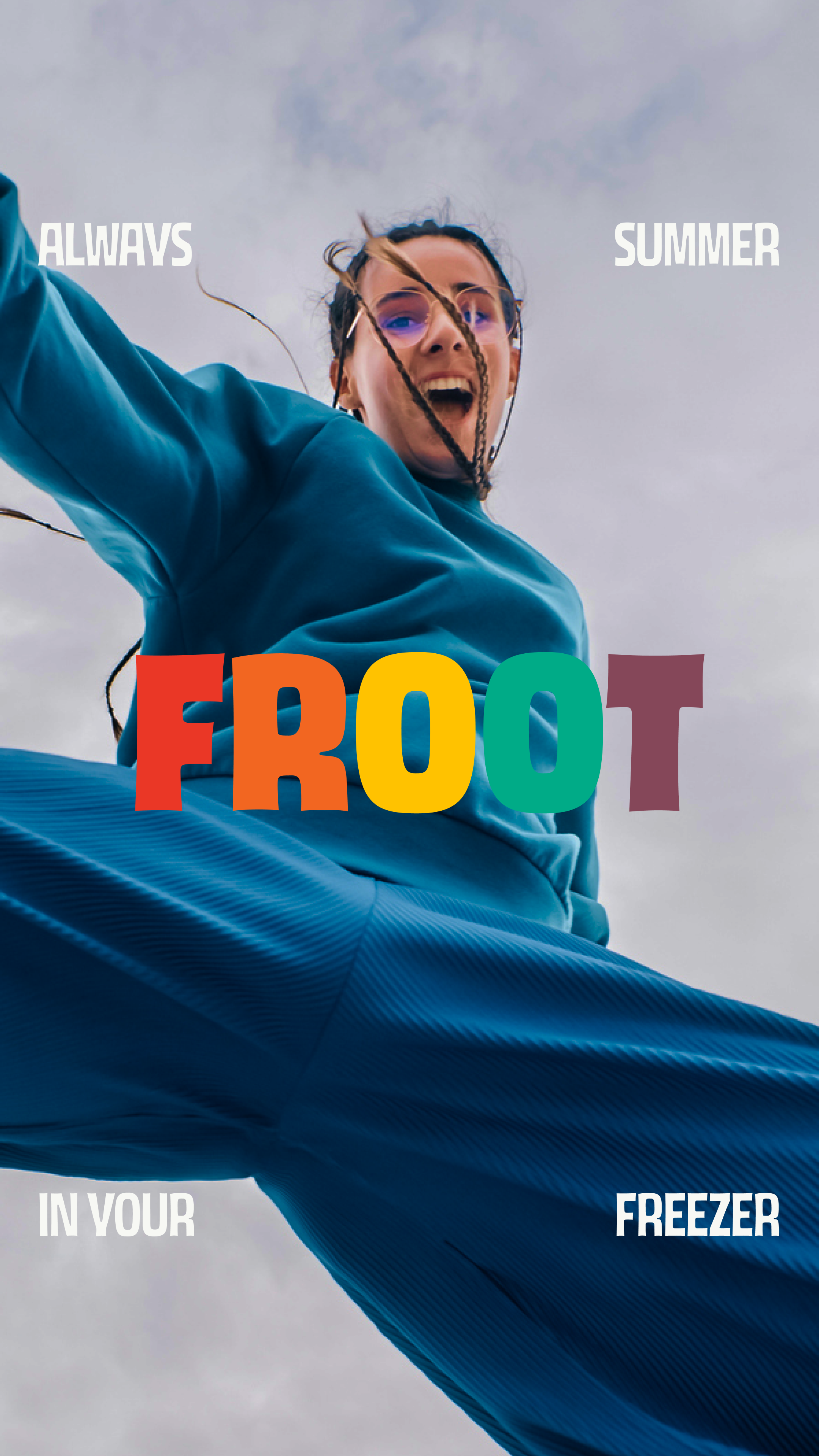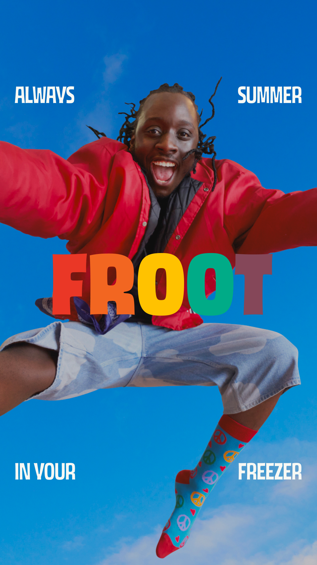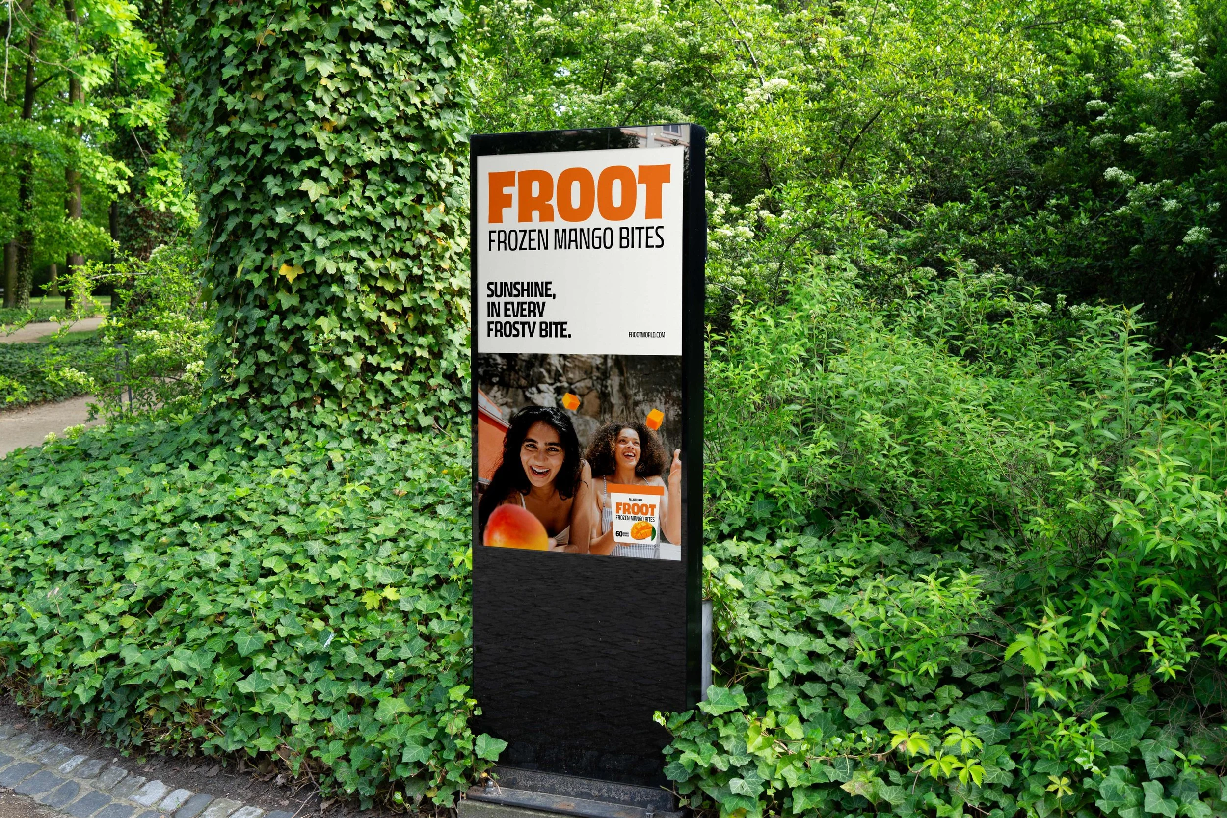
Froot is a frozen fruits healthy snack brand, based in Egypt. From the get go we wanted to change the narrative of the market, that healthy food should be boring. From naming and positioning to packaging and branding, our goal was to prove that wellness can be a blast. The result? A visual language that’s simple, fun, energetic, and looks as good as it tastes.
Naming
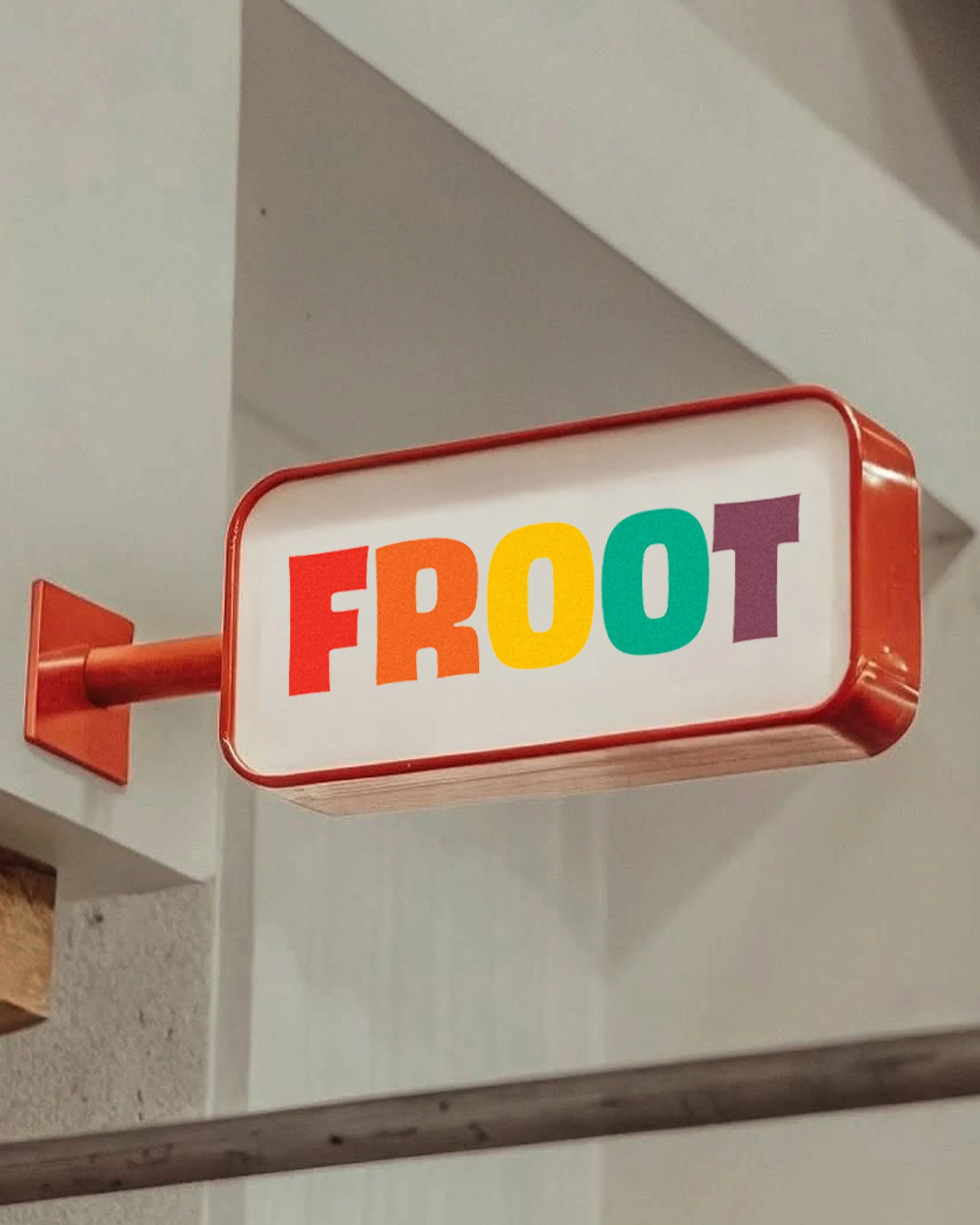
Identity
Branding
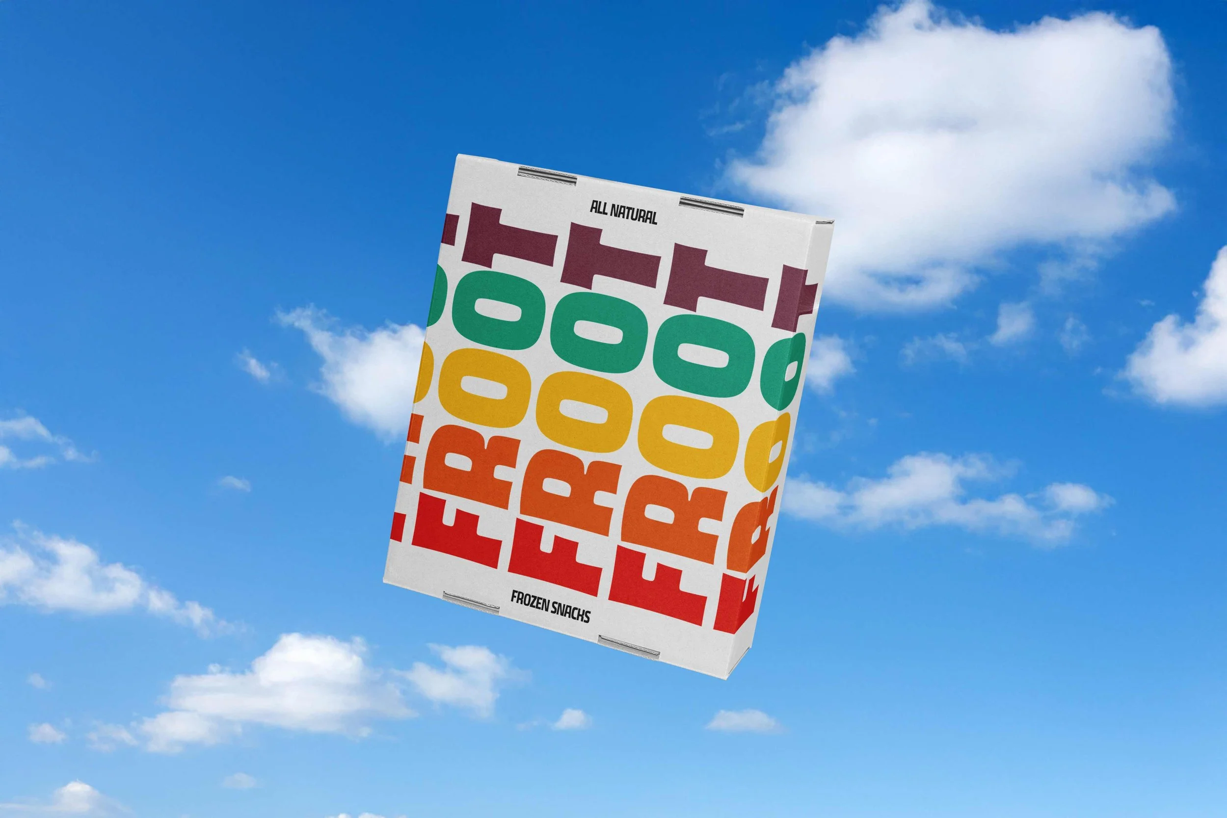
Packaging
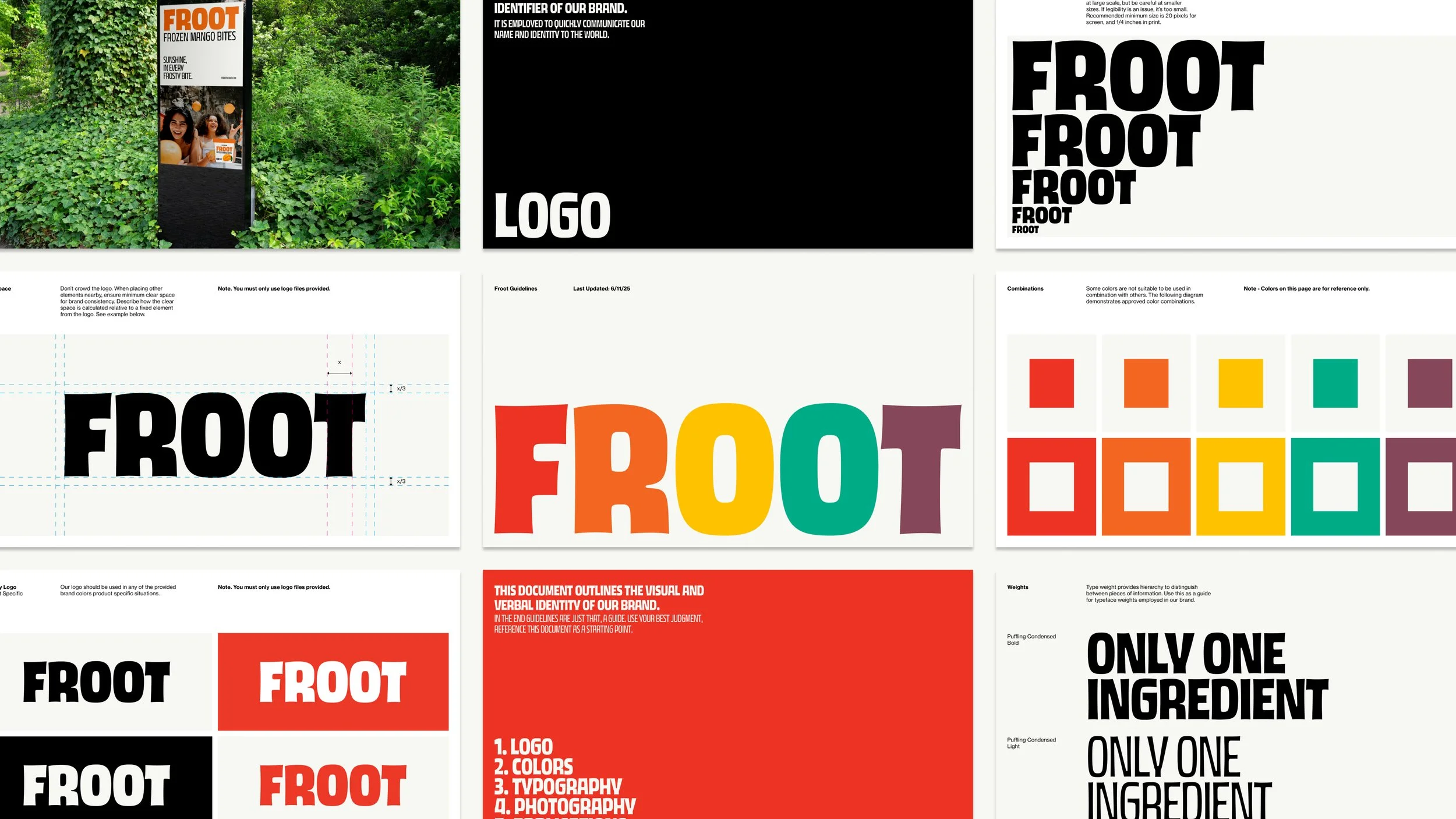
Guidelines

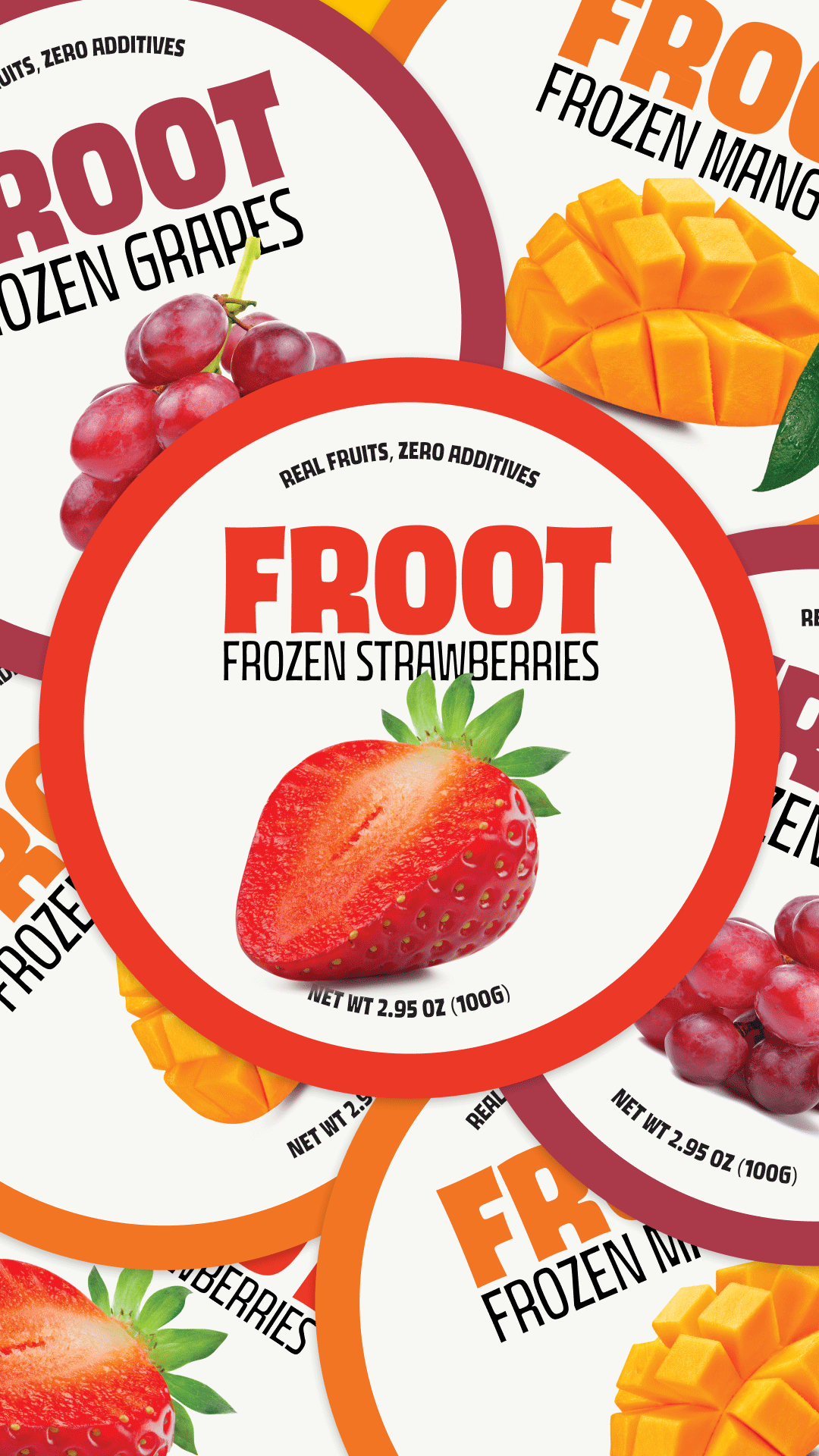
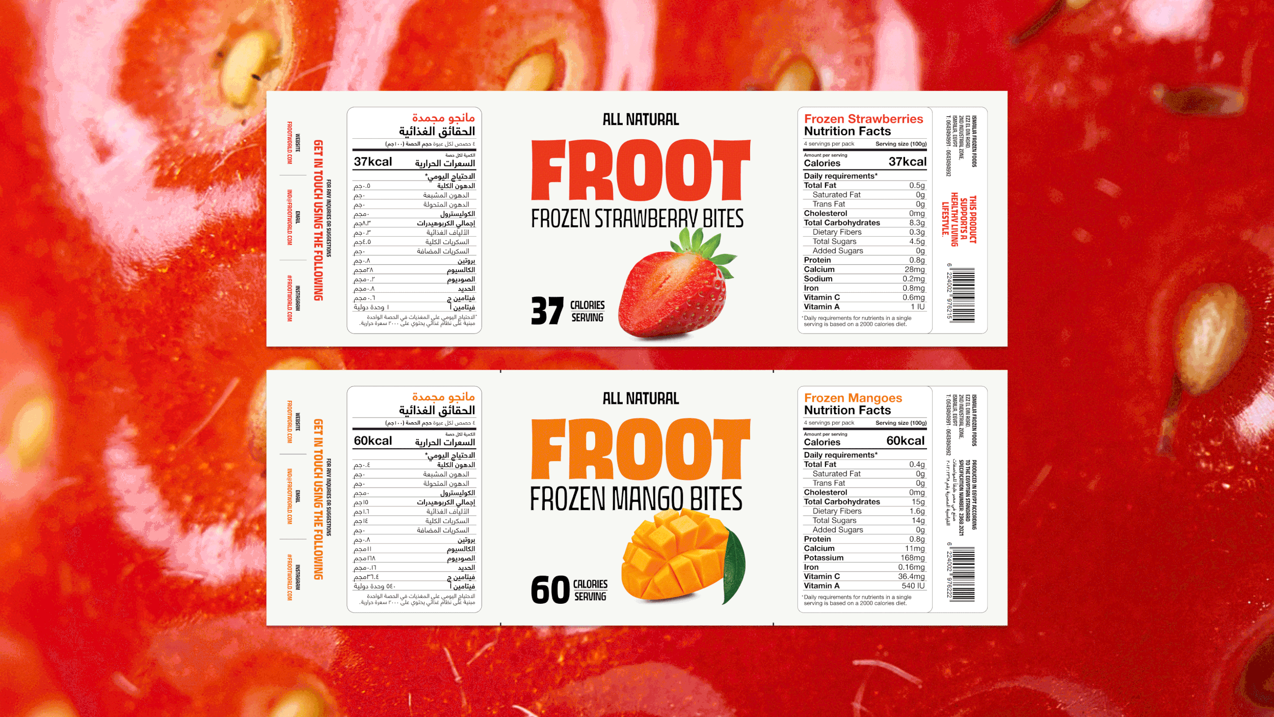
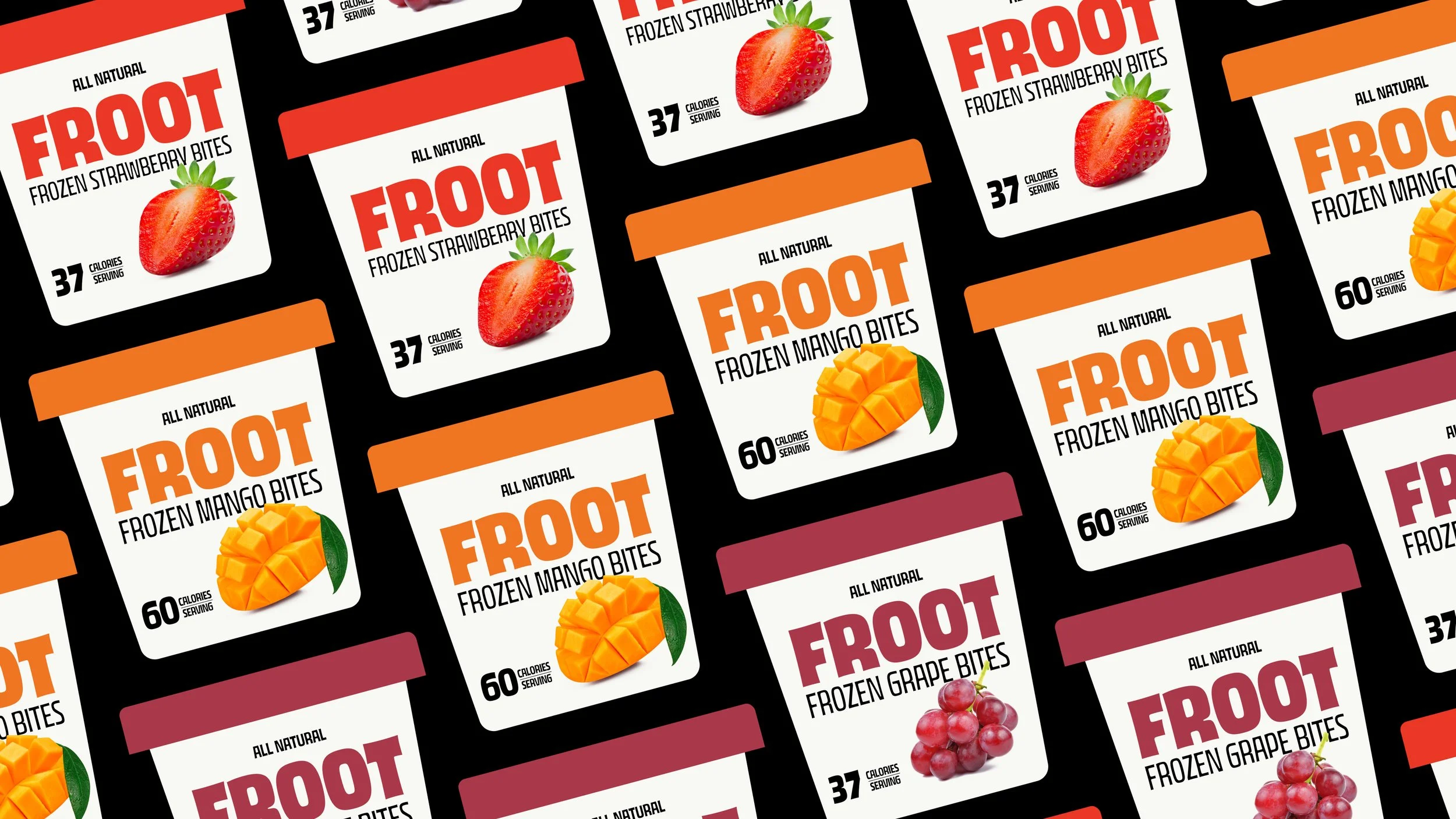
Each package color draws inspiration from the products natural color. Reiteratinng the natural part in a subhead, as well as, showing the calories/serving on the front of each pack.
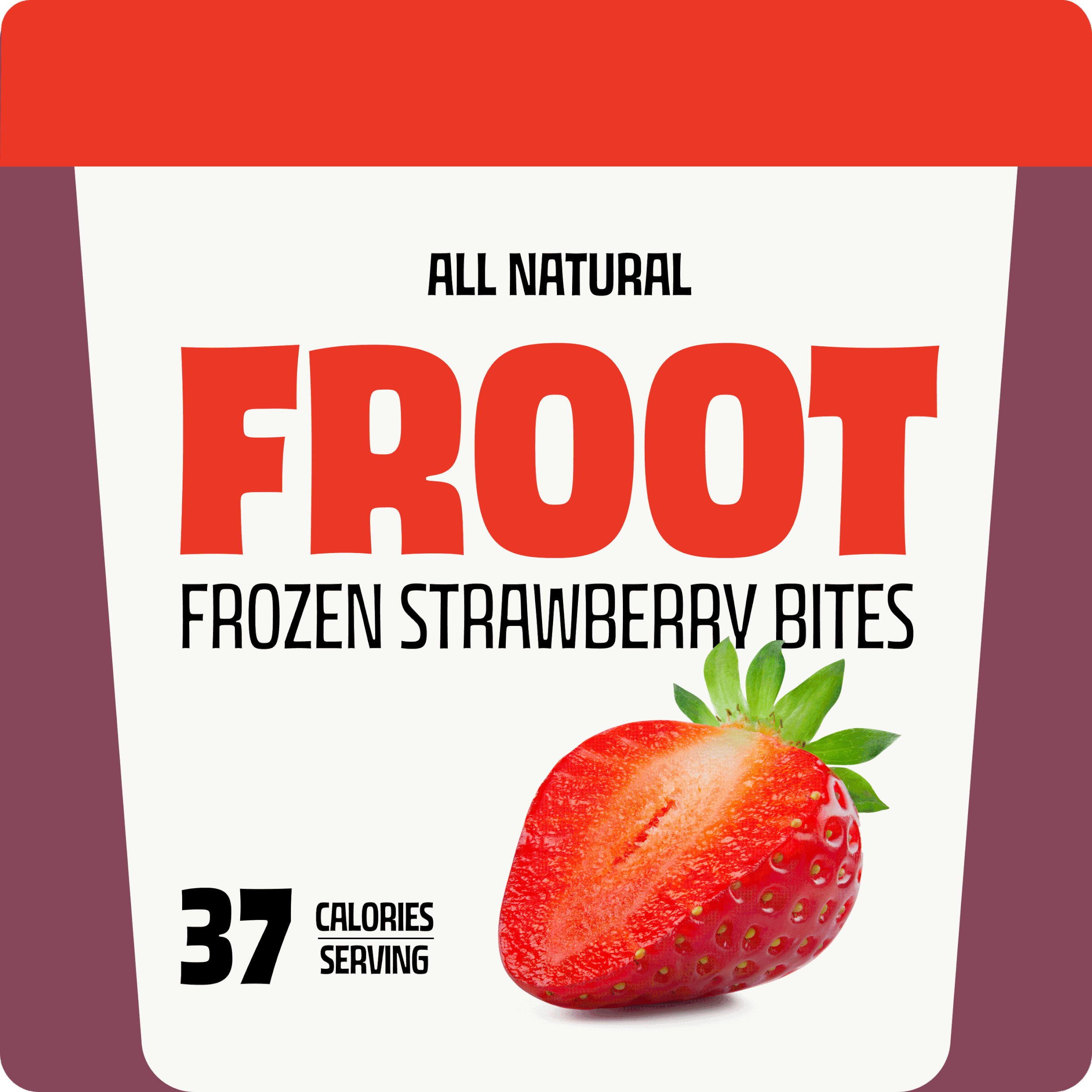
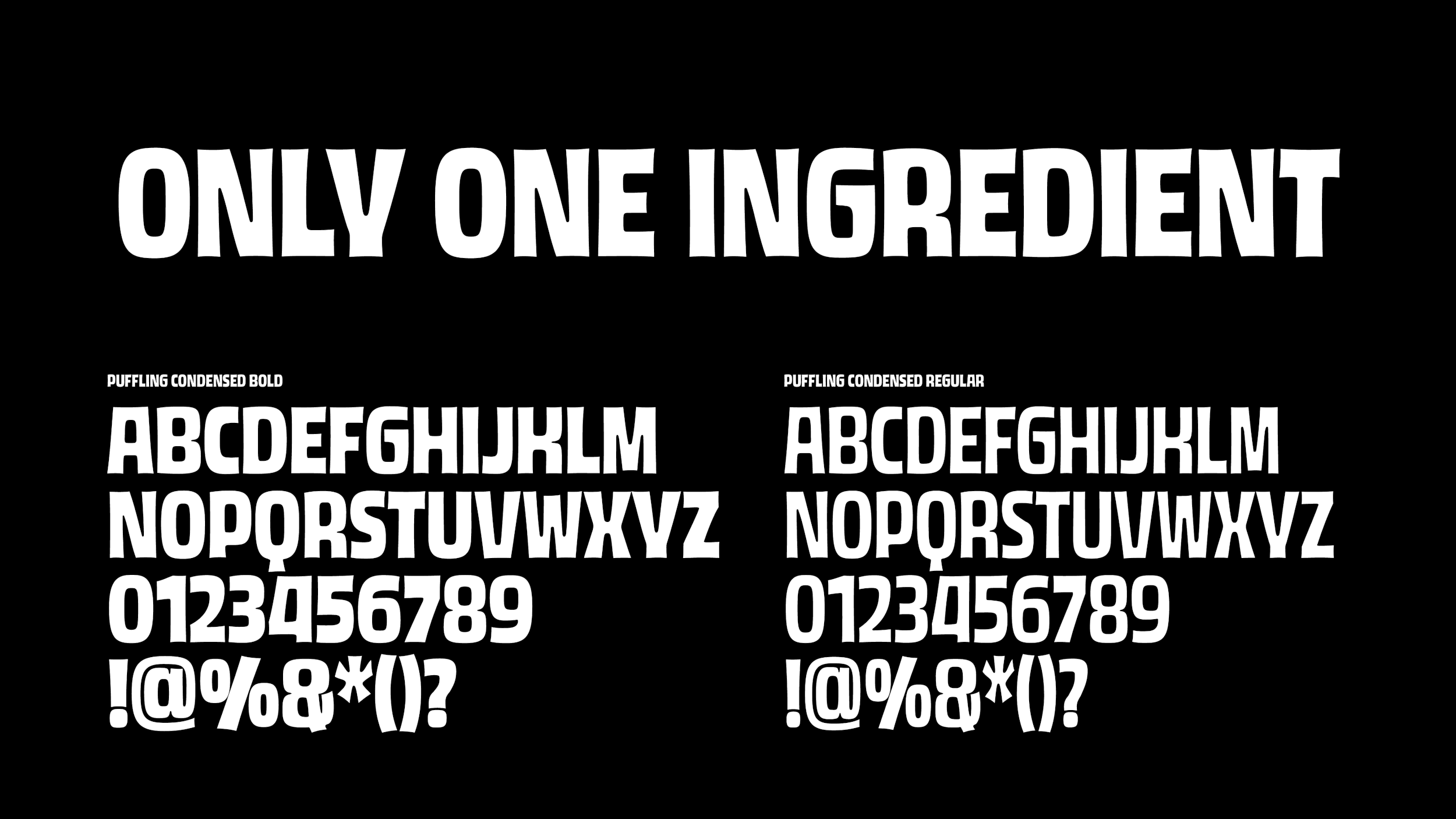
The main logo was constructed with a friendly and fun sans-serif font that was subtely altered, utlizing colors of different some fruits.